Level up your data visualization now. With Looker Studio the limitations of traditional analytics are history. In this blog post, we’ll explore how this powerful tool is revolutionizing the way organizations analyze and present their data. Google Analytics 4 offers deep insights into user behavior and website performance. Looker Studio offers a dynamic and feature-rich alternative or complement to GA4.
Whether you’re a builder of websites and mobile apps, a data analyst, a business intelligence professional, or simply someone who wants to unleash the true potential of their data, Looker Studio is here to empower you with its intuitive and visually stunning features.
What Is Looker Studio?
Originally Google Data Studio, this product was introduced in 2016 as a free reporting and dashboarding tool that provided connectors to Google Analytics data APIs and a host of other data sources. Rather than forcing the Google Analytics web views to be something they are not intended to be, Data Studio allows you to create basic layouts with built-in reporting widgets that can be customized using formulas. Like a custom-tailored Google Sheets/Excel solution for analytics data. Additional data connectors allow you to visualize other data sources alongside your analytics data. Being completely separate from GA means you can create views for groups or individuals that are customized specifically for an audience. And the familiar Google built-in security and sharing features ensure the intended people can only see appropriate reports. When Looker was acquired in 2020 to become the Business Intelligence identity of Google, Google Data Studio got rebranded as Looker Studio.
Where To Begin?
In this article, we will build a dashboard that visualizes reporting data from GA4. We will use the sample data provided with the connector, but feel free to use your actual data for the exercise.
Step 1: Sign Up And Create Your Project
Visit https://lookerstudio.google.com/ in a browser and select “Home” or a banner link to begin. Sign in with valid Google credentials, and you will be presented with a home screen:

For this exercise, we will choose “Blank Report”. Once selected you will be presented with a new report, and the Data Connector Panel will be open (if it is not open, select the “Add data” control):
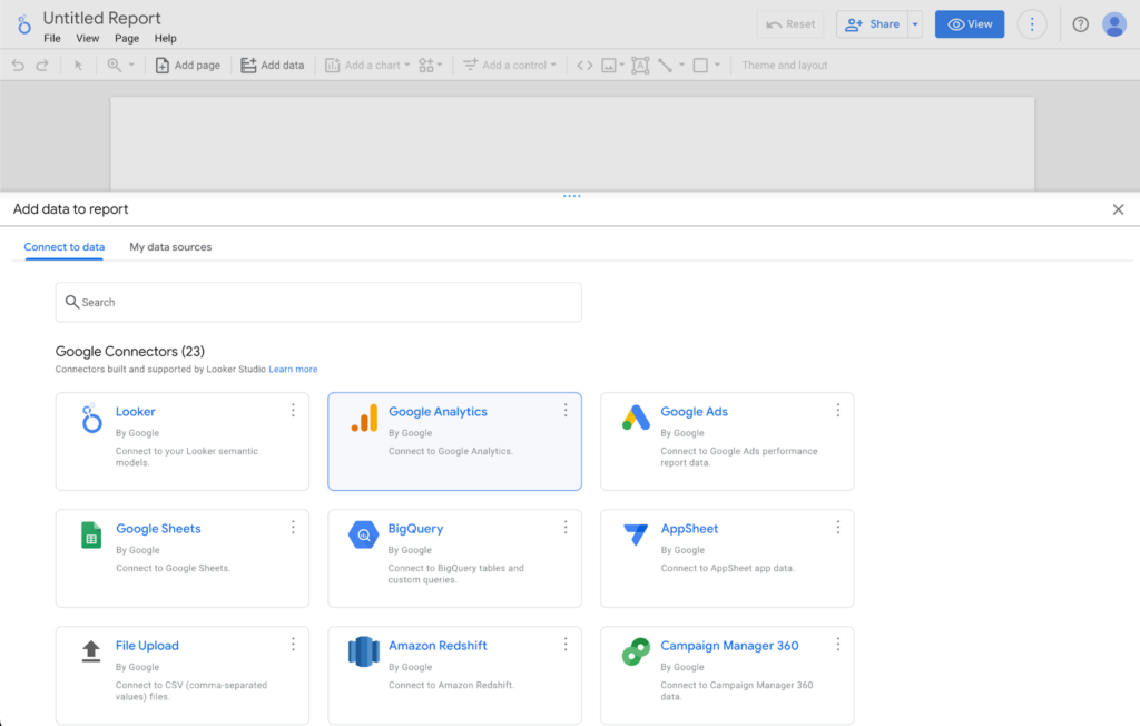
There are a number of Data Connectors to choose from – a handful of built-in Connectors from Google, and a growing number of Partner Connectors that allow you to connect data from all of the major data aggregation tools, and also the ability to craft your own custom Connectors to any data source you might find useful in your reporting. Caution: many Partner Connectors are monetized and require a subscription to use. If you would like to use your own GA4 data for this exercise, choose Google Analytics and follow the prompts to connect to any instance that you have access to.
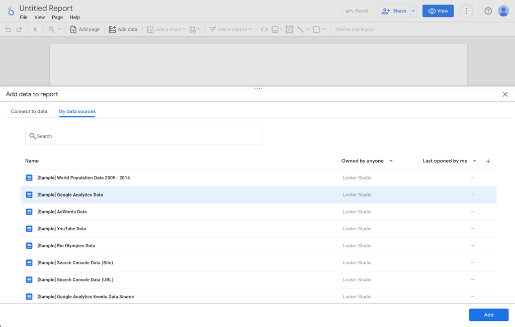
For the purposes of this guide, I will choose “My data sources” and Add the “[Sample] Google Analytics Data” data source and follow the prompts:
Step 2: Basic Dashboard Layout And Controls
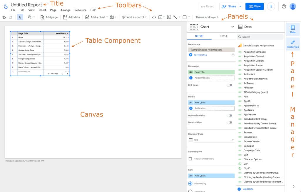
When you select the sample data source, Looker Studio should automatically generate a widget with some tabular data inside. Let’s go over the names of some controls and the main layout.
The Title and Toolbars should be familiar to a Google application user. Feel free to update the title by clicking it. I will name mine “Traffic Dashboard”.
The area for designing your dashboard layout is called the “Canvas”. The canvas can be resized, but you might want to wait until you get a bit farther before adjusting.
The widgets you create and move around the canvas are called “Components”.
Docked to the right side by default are the “Panels” and “Panel Manager”. The Panel Manager simply allows you to expand/collapse Panels. The “Properties Panel” (which is titled “Chart” in this screenshot) offers a convenient way to create and modify Components. When the name at the top of the Panel is clicked, you can select different Component Types. We will dig deeper into the settings in this Panel in a bit. To the side of the Properties Panel is the “Data Panel”, which allows you to filter and click/drag any fields available from your current data sources.
So, first thing: let’s delete the Table Component that was automatically generated (right-click => Delete or click Edit from the Toolbar => Delete).
Next, let’s add a simple header to our dashboard. This will give the report an area for identity and also filters, which should help the view look more like a “website” that your users will be comfortable using. Click Insert from the Toolbar and scroll way down to choose Rectangle:
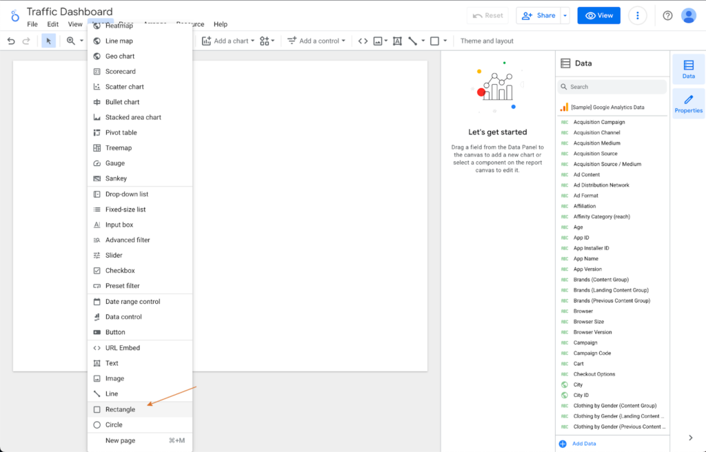
The cursor changes to a crosshair that helps you click/drag a shape across the top of the page. The edges will turn red when you are aligned with other controls or the edge of the canvas. If you don’t get it quite right, you can click and readjust anything you add to the canvas. Let’s check out the Properties Panel to customize our Rectangle:
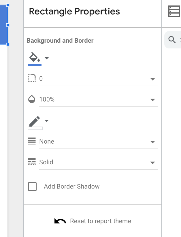
The Panel allows you to customize the background color, opacity, and border properties for the Rectangle. I will change the color to blue. I would also like to add a logo, and there are a few ways to do that. Let’s use this control on the lower Toolbar – you can upload an image from your computer or provide a URL:
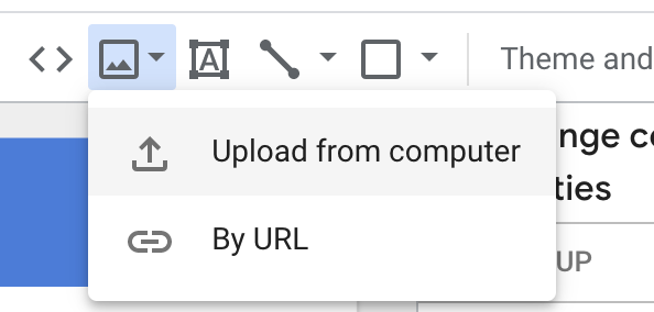
I will click/drag the logo into the top-left corner, and now we can move on to some data driven controls.
Step 3: Create A Scorecard Component
A Scorecard Component is an excellent widget for displaying a single value, such as a total. To add a Scorecard to the Canvas, select Insert from the Toolbar and then Scorecard:
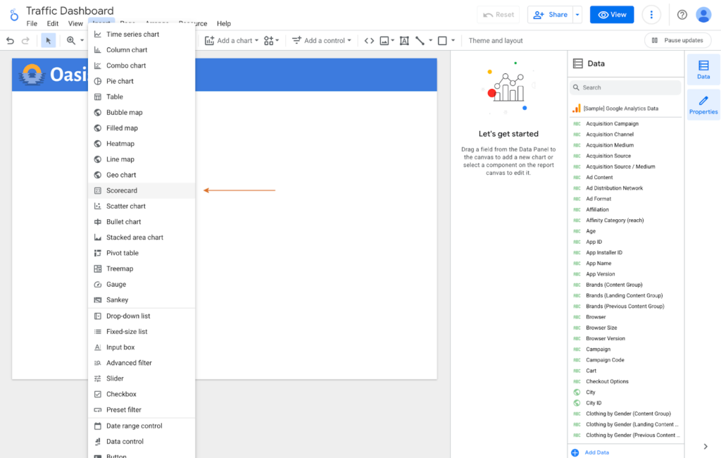
The cursor changes to crosshairs, allowing you to click the Scorecard onto the Canvas. Some Component Properties are defined by default, when you place the Scorecard. Notice in the Properties Panel, the Data source is set, and the Metric is set to “New Users”. That seems like a logical metric, so let’s keep it. It might be nice to see a sparkline to watch this total accumulate over time. So click “Add dimension” under “Sparkline” and choose “Date”:
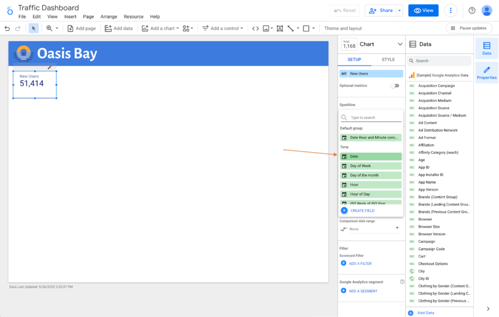
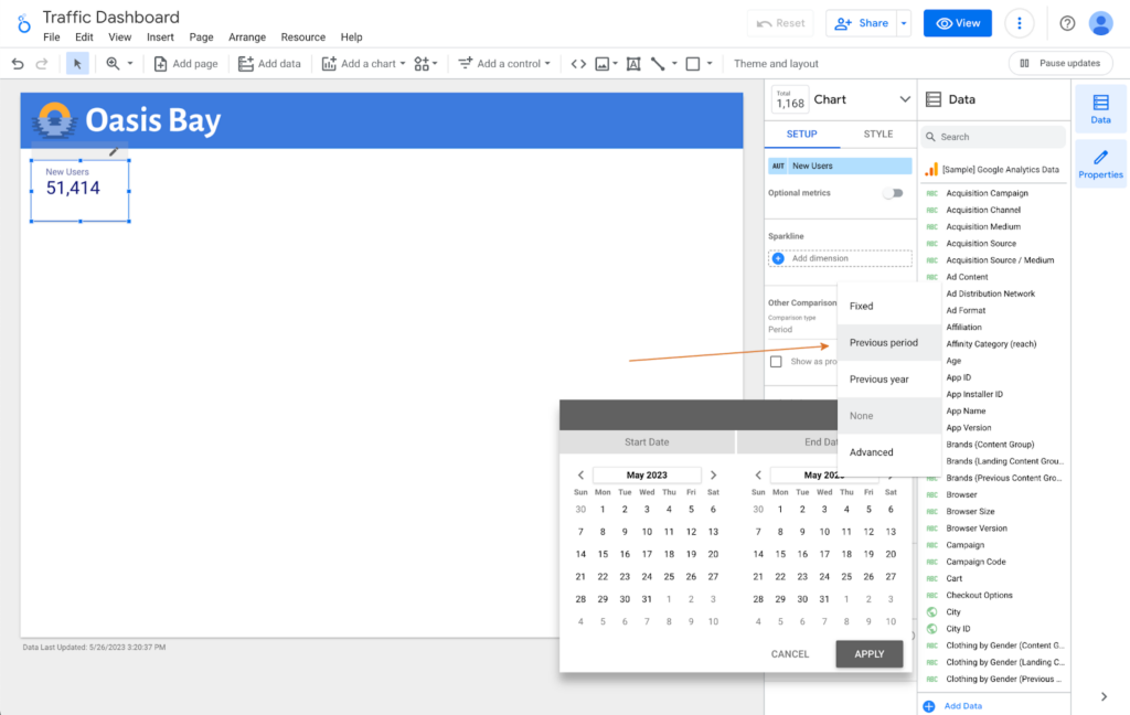
Now we have a squiggle under our Scorecard total that shows New Users by Date over time. But there is no way to get more detail from this Sparkline – how do I see the date axis to analyze a spike or a dip? Let’s uncheck this box. We will cover a better way to Sparkline, later. Let’s instead choose “Comparison date range”, then “Previous period”, and then “Apply” to display an increase/decrease indicator and amount in our Scorecard:
Before moving on, let’s look at the other tab in the Component Properties Panel: Style. Feel free to play around with the controls to see how they change the Component. I’m going to check the “Add Border Shadow” box to help the Component stand out on the page.
Step 4: Create More Scorecards
This tool makes creating these Components pretty simple, and creating similar items will be even easier. Let’s select our Scorecard, right click => Duplicate. Now you have a copy of the Component that you can drag and align to the right of the New Users Scorecard. You could also use keyboard shortcuts to copy/paste, or use the Toolbar – the UI is very flexible.
Let’s update the Metric for the second Scorecard to use Sessions:
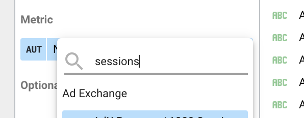
And for our third Scorecard, let’s duplicate and position a Component that you already created, and this time change the Metric to “Revenue”. Notice the large number that is too long to fit inside the Scorecard. When dealing with large totals over time, you might not care about the exact number, but rather the number rounded to thousands or millions. A handy way to compact these large numbers to keep your dashboard looking tidy is the “Compact numbers” setting in the Component Properties Panel STYLE tab. Go ahead and select that to display a more appropriate number formatting:

Your Scorecards are in place, and your view should look something like this:

Step 5: Create A Chart
Scorecards allow us to show important totals big and bold in reports. To compare data with a common dimension, there are a number of charts at your fingertips in Looker Studio. If we want to display source segmentation to see where our traffic is coming from, there are a number of ways to chart that information. For the benefit of readers who are either unfamiliar with their data or new to charting it, we will try a few different visualizations to see how they look. Let’s start with a Column Chart – add it to your Canvas by selecting “Add a chart” from the lower Toolbar and then select “Column chart” from the “Bar” category:
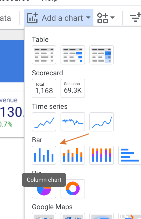
Click to place your Component. I chose to place mine to the right of the Scorecards, and stretched it most of the way to the edge.
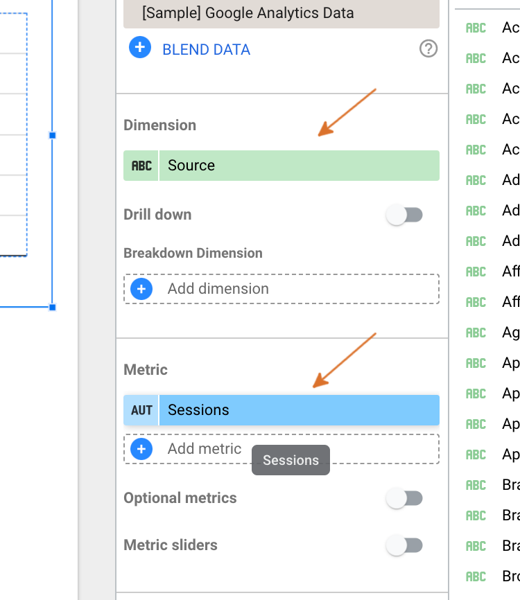
In order to display segmentation, we need to adjust some parameters in the Component Properties Panel. With your Column Chart selected, choose Source as the Dimension – there are so many choices, you may want to search “source” to filter the Dimensions. And then choose Sessions as your Metric:
And we have a graph on our Canvas that looks…well…not very useful:
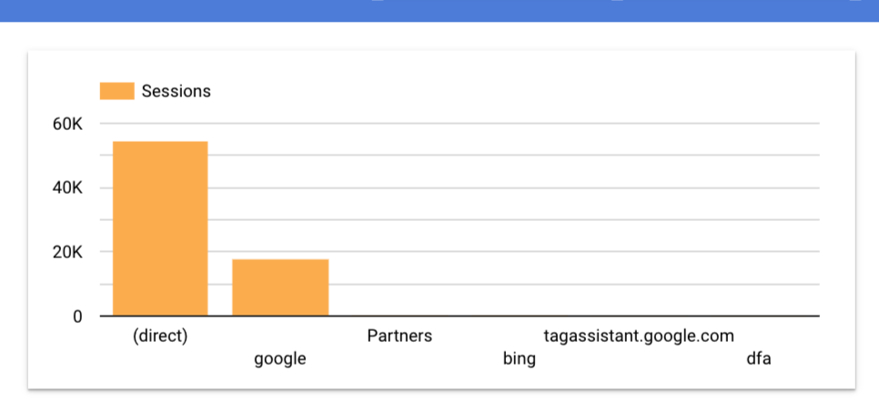
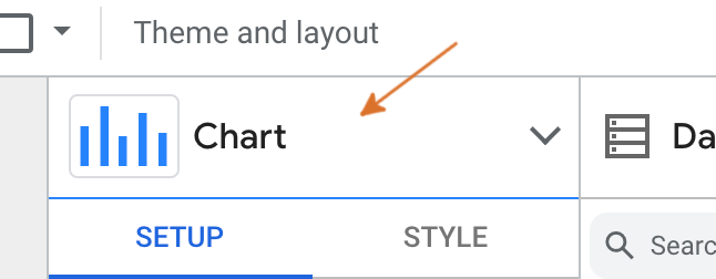
You can hover the bars to see actual totals, which is helpful. But this Component is mostly empty space. Your actual data might look better – but for my example, I think I need to try something different. Good news! It’s simple to experiment with different Chart types without losing progress. Click “Chart” at the top of the Component Properties Panel:
And then select Bar Chart; a horizontal version of the Column Chart:
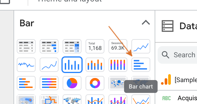
This looks a little bit better – when comparing large and small numbers, it helps to measure along the “longer” dimension of a graph…but the Bing number doesn’t register so much as a sliver:
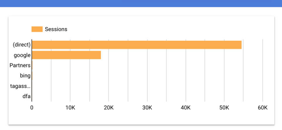
So we want to compare very large numbers with very small, and the data visualization should be informative and also aesthetic. Let’s try a Pie chart:
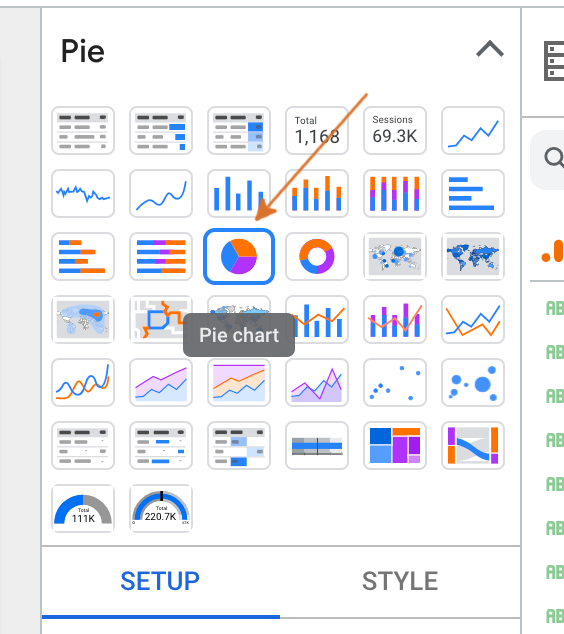
This looks much better, and we can sort of see the smaller numbers visualized:
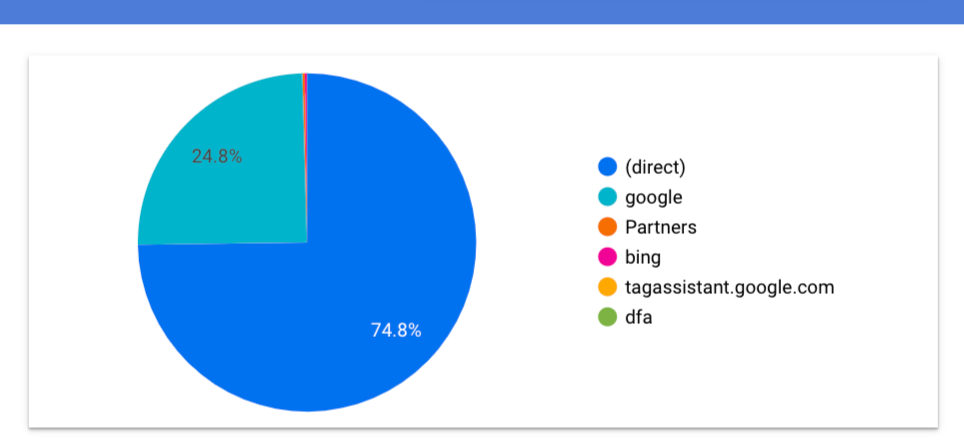
This might suit your needs. But you need to see the actual numbers without a microscopic mouseover, maybe a table is the better way to go. Tabular data may not be the most aesthetically pleasing control in the toolbox, but it offers interaction that other controls cannot. Select “Table with heatmap” from the now familiar Chart section of the Component Properties Panel:
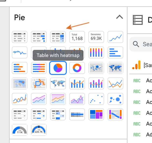
Heatmap adds an extra bit of visual information to your report to draw attention to larger values. The tiny values are still easy to read, but this should provide a control that is highly functional and practical, but also visually compelling and informative:
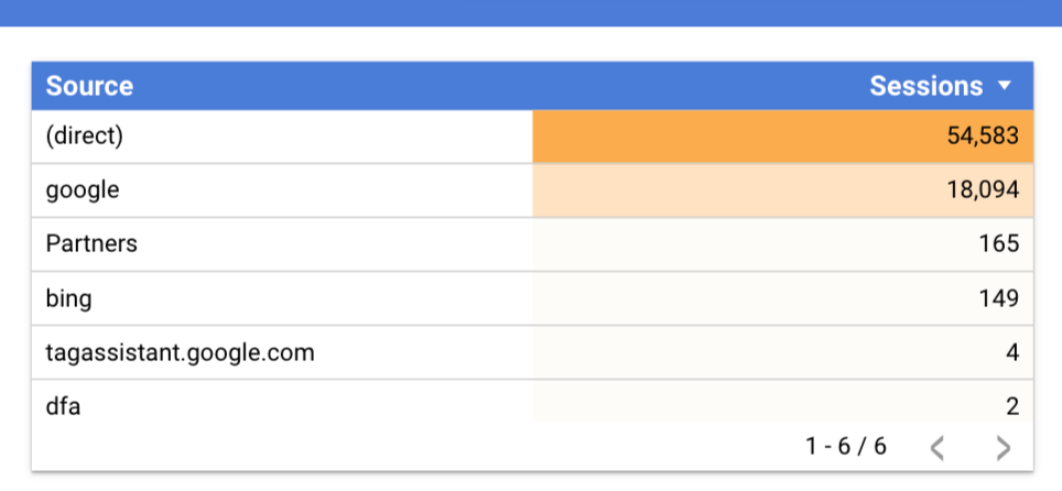
Tables offer sorting and pagination with no extra effort. With many configuration options – you can modify the fonts, colors, borders, shadows and even toggle the row numbers and pagination to suit your needs, via Component Properties Panel: Style.
Step 6: Create More Charts
This is a good time to revisit our lackluster Scorecard Sparkline. I would like to see the Scorecard data charted over time, but with a more functional Component. So as before, Duplicate the New Users Scorecard, place it beneath the Scorecard, and then from the Component Properties Panel, select “Sparkline chart”:
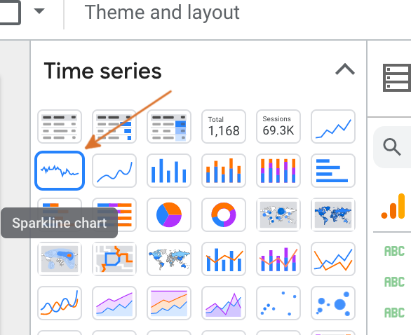
The data remains wired up like the Scorecard above. I’ll just modify the styling a bit, and check the “Show axis title” box. It looks good, and you can hover over the line to see the dates in the data:
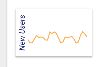
Repeat the process above for the other two Sparklines. Hopefully the controls are feeling intuitive by this point. We are displaying the same sparkline information as before, but this Component is visually and functionally superior:

Step 7: Create A Master Filter
Filters add excellent value to your dashboard. Looker Studio allows you to bind a filter to a single Component, a group of Components, or the entire page. A master filter at the top of the page can be used to adjust all of the Components on the page. Select “Add a control” and then “Date range control” and place the control in the header:
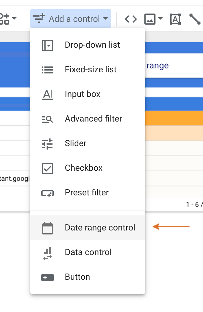
And then, set up the default by clicking “Default date range” in the Component Properties Panel, and then change “Auto date range” to “Last 7 days”:
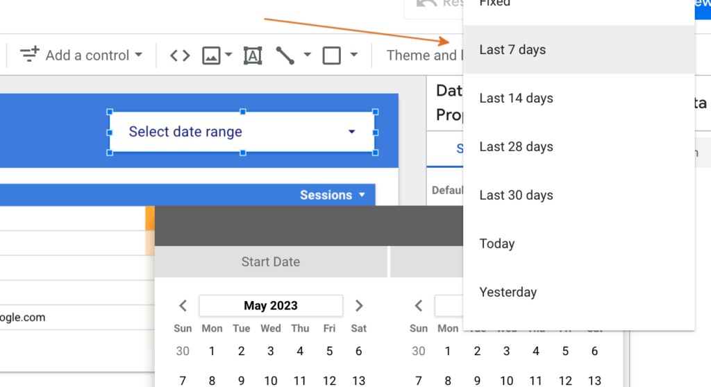
I don’t recommend choosing “Include today”, since data takes at least a day to process. A user can now toggle the date range to see the data for the selected time period.
Step 8: A Useful Pie Chart
We tried a pie chart to display source segmentation, and it wasn’t a good fit. So what are pie charts good for? Pie charts are a visually informative way to present a set of items that is greater than, say, 5. And have a mostly even distribution. In our first pie chart, we had one dominant value, a minor value, and more almost invisible values. So let’s try again, and display the top pages on our website.
Add a Chart Component, and set the Dimension to “Page Title” and the Metric to “Users”:
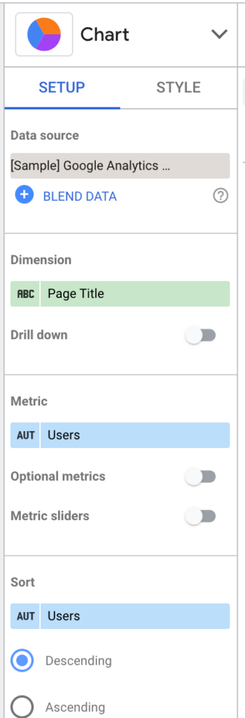
I placed the chart beneath the Sparklines, and it looks good, right out of the box:
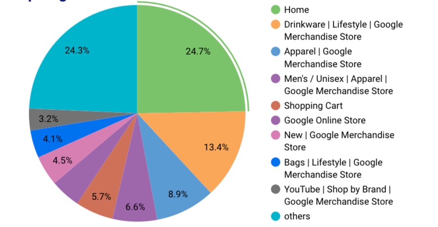
Update the styling if you like, but there’s an important facet that this Component does not provide: a title! A user could probably guess what this chart is telling them, but we can do better.
Choose the ad hoc “Text” control from the lower Toolbar, and place the title over your pie chart:

I named mine “Top Pages”. You can style the text as you please with the Component Properties Panel.
Step 9: Geo Chart
For most organizations, a map is not very useful for visualizing analytics data. It takes up a lot of Canvas real estate, and doesn’t really tell you much. However (this is a BIG however), people love maps on dashboards. It draws the eye, looks attractive, and can give a user a sense of scale that is more compelling as a “hard data” Component. “Look at our reach!” “San Francisco loves us!” So map visualizations are here to stay.
You can follow the usual steps to add the Component: “Add a chart” => “Geo chart”, and place the map to the right of your Pie Chart. You probably want to spend a bit more time in the Component Properties Panel than we have for other Components, in order to make the chart meaningful in scale and data. For my chart, I only want to see Sessions for the USA. To optimize the data, we will create a filter. Click “ADD A FILTER” and then “CREATE A FILTER”:
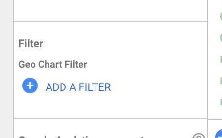
And set up the filter to limit the data to the region you are interested in. Here are my settings:

Note: If you ever want to modify your Filters, finding the editor is a bit tricky. From the Top Toolbar, choose Resource => “Manage filters”.
This has limited the source data, but you likely want the default image of the map to be zoomed in to the region that you are interested in. To accomplish that and the “bubble” visualization of Sessions on our map, let’s use the following settings:

There is a lot to play with. Take some time to refine these settings and the styling to personalize your map. You can right-click => “Duplicate” your “Top Pages” Text Component, rename it “Sessions”, and place it over the map. Our page is really coming along!
Step 10: Top Days
We are not covering every type of Component in this guide. But let’s cover a few more to add some value to our example dashboard, and maybe help spawn ideas for visualizations that are useful for your organization. You might have ads, emails, or other tactics to get attention. And you might want to know which days people are most likely to look at your website – or least likely – and turn that into an opportunity for targeted conversions. For my example, I want to rank days of the week by Sessions and by Revenue, in order to see when the traffic is hot or cold, and also know when visitors are likely to buy things. Let’s try a Combo Chart to see both values on the day of the week axis.
Create a “Combo chart”, and set up the following properties:
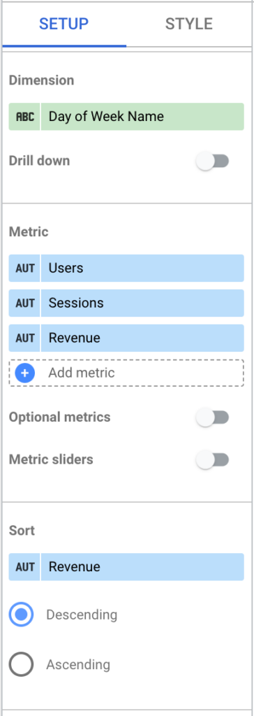
I want to sort by Revenue, because the differences in the little bars are hard to discern, visually. And try the following Style settings:

This will set up our Users Metric as a line, and the Sessions and Revenue as bars. Notice how the values are normalized, so the y-axis is a common value. Because we coupled the Users/Sessions with Revenue, we have discovered a pattern: some lower traffic days are generating more Revenue. This could be a result of targeted ads or specials. We can now use this information to pivot strategy, or confirm our assumptions. This kind of chart could be a launchpad for new GA “Goals”. I hope this illustrates how coupling disparate pieces of data can yield surprising results. Cap off your Combo Chart with a Title. You should be familiar with the process, now that you have done it a few times.
Step 11: The Line
It’s obvious that Line charts are useful to track a value over a period of time. But like the previous example, lines are also useful to visualize differences in amounts. They may come in handy for data that is less about the details; the actual amounts – for data that informs with a quick glance, the difference between buckets or categories. Let’s try visualizing the age of our visitors. This data is generated by Google AI, and should be more and more accurate these days. Create a new “Line chart” and place it to the right of your “Top Days” Component. Then, simply set the Properties to:
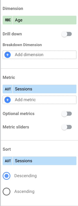
Top it with a title (Sessions By Age Group), and let’s see what we have:
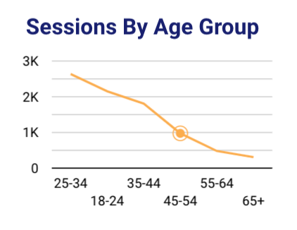
We are most interested in the sort order here. But the line is a great way to visualize the difference between the “age buckets”.
Step 12: Gauges
Gauges are highly-prized dashboard Components. They are typically used to show how an actual value compares to a goal. If you use Goals in your Google Analytics to measure conversions, this is probably the type of data visualization for it. Our sample data is not well-suited for this type of visualization, but we can set an arbitrary target to show how you might use it.
Drop a Gauge Component next to your age group line chart, and use Revenue for your Metric. For lack of an actual Target, we can assign one manually in the Component Properties Style Panel:
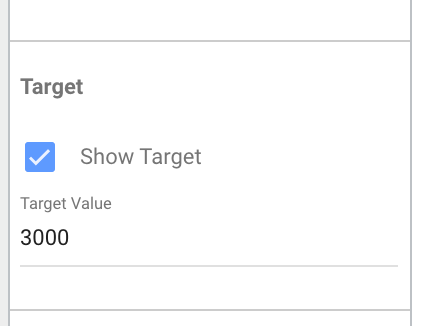
Cap it with a title (Revenue Goal), and we now have a full Dashboard!
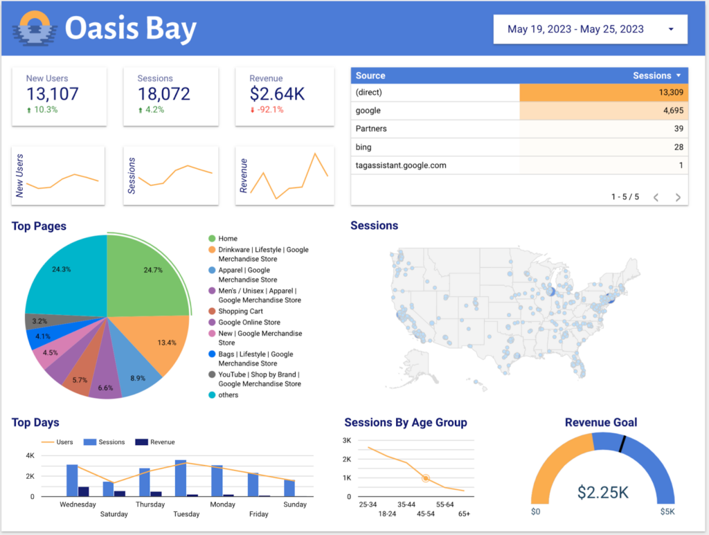
The little line in the gauge shows us where the target is. It’s a bit frustrating that the mouseover doesn’t tell us what the target is, so I will add a small Text Component caption to fill the gap left by the tool. Let’s add a background to row 3.
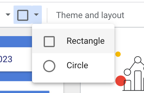
I think we have some very useful visualizations here, but the bottom of the Dashboard looks cluttered to me. I’d like to add some sort of division between the second and third rows of Charts. Select the arrow next to the square image from the Lower Toolbar and choose “Rectangle”:
Then, take your crosshairs and click-drag your Rectangle Component over the third row of controls:
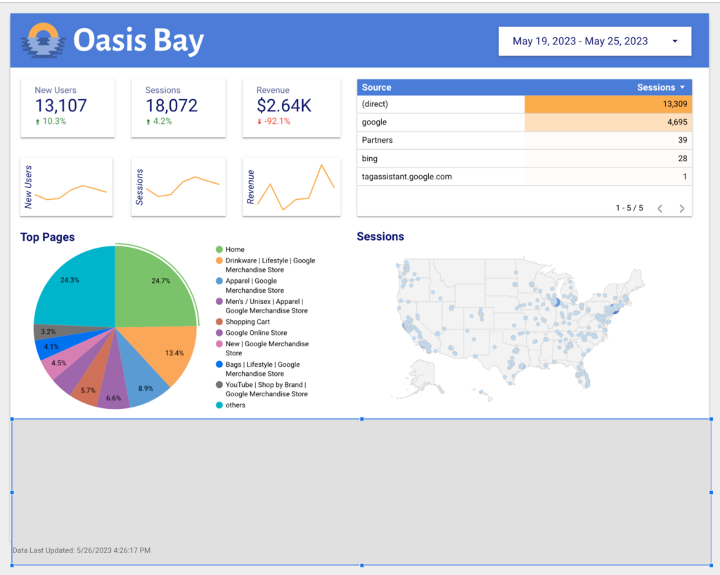
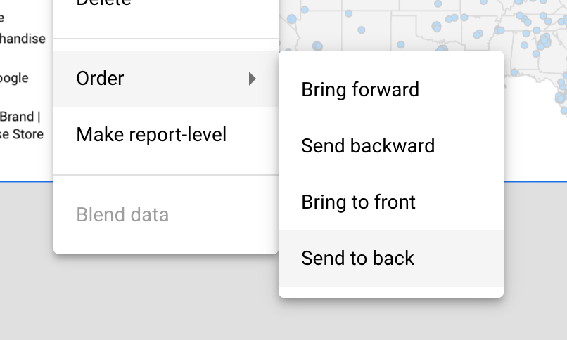
Looks great! Ship it! Sometimes, we don’t build things from the bottom up. You might need to add a background layer after adding foreground items to your Canvas. Or you might have multiple layers that overlap. This tool has a built in concept of layers that is pretty easy to work with. Simply right-click your Rectangle Component, choose Order, and then “Send to back”:
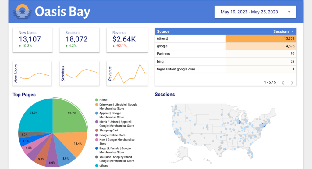
Our Dashboard is now complete!
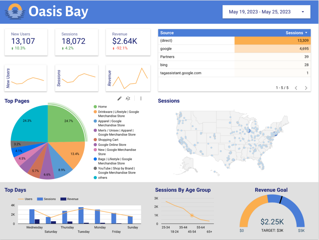
We quickly built a view from scratch that would not be possible to build in Google Analytics. This dashboard is packed with valuable information, and is a living thing; as new data is logged, the dashboard updates and will show history as far back as your source account allows (more on this, in a moment).
Now that you have built the dashboard, let’s share it.
Step 12: Sharing
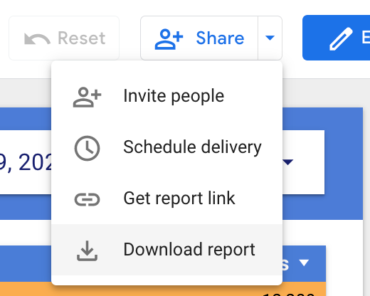
Google application users will be familiar with the Looker Studio sharing options. You can add and notify users as Editors or Viewers. You can download the report as a PDF snapshot of the current set of data – so can any allowed viewers – and add password protection. Or just copy a URL that you can message to a colleague. Just use the Share button at the top of the interface:
Data Limitations
As I mentioned in the previous article, “Migrating from Universal Analytics to Google Analytics 4: What You Need To Know”, Google Analytics 4 limits data consumption for free users’ GA. There is a limit to the amount of data that you pass through the Connectors that use GA APIs. These caps will likely change over time, but a good overview can be found in the PIWIK blog (https://piwik.pro/blog/looker-studio-former-data-studio-ga4-connector-quota-limit-errors/).
The cliff’s notes version is: if you read data directly from GA, there are limitations on concurrent, hourly, and daily traffic. If you need to share your Dashboard with a wide audience, any viewing or changing of the filters counts against these governors. If this happens to you, there are options:
- Share a PDF, rather than the live view. This is not ideal. You are sacrificing the “live” view of things and changing the filters to see historical data.
- Limit your audience. If only a few users have access to the report, that will help prevent overage.
- Upgrade to GA4 360. If you have the budget, this is a viable option.
- Use a BigQuery connector. The “pay as you go” pricing model might be attractive to some organizations that would like to prevent running into these data caps.
Also covered in the previous article, it can take up to 48 hours for collected data to become visible in GA.
And finally, the maximum lifespan of GA4 data is 14 months. The default is 2 months. Be sure to update this setting in the GA4 Admin controls to take advantage of the maximum retention time. And again, if you use BigQuery, your data is safe in the BigQuery world. The more tech-savvy organization could also download the data and provide their own Connector.
The Rest
This has been rather lengthy for a quickstart guide, but there is so much more to Looker Studio than these basic examples. Obviously, your own data should guide your choices. This Dashboard is more than a “web page”; it is truly a “web application”. As such, it pays to take the time to dig deeper and provide the most effective visualizations that you can. You already have your hands dirty with Component customization, and hopefully you have a good base level of knowledge to know what is available and what is appropriate for your needs. There are a few big things we haven’t covered in this article:
- Custom Fields
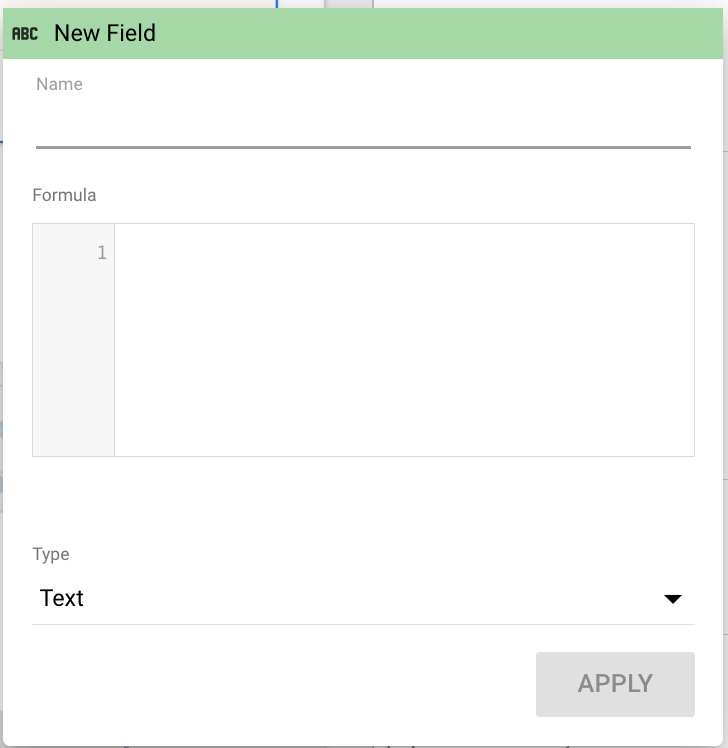
- You are not limited to visualizing one Data Source, right out of the box. You can create your own fields based on calculations with multiple fields. The syntax is simple enough to figure out. Here’s a good place to start (https://cloud.google.com/looker/docs/functions-and-operators). Select “CREATE FIELD” from the dimension or Metric field chooser menu to get started:
- Multiple pages
- You can create multiple canvases in one “link”. The pages can be accessed via a navigation panel. This would be great for an organization with multiple web/app properties. Or differing concerns: perhaps your marketing department would like to see a dashboard that is completely different from the dashboard for ops?
- Other Data Sources
- Pull in data from Search Console, Ads, your internal databases, or choose from hundreds of 3rd party connectors for Facebook, Instagram, Shopify, HubSpot, and many, many more. Partner Connectors are subscription-based, but typically offer a trial. Some vendors offer multiple connectors, which may be a good value for you.
- Blended Data
- You don’t need to be a DBA to configure blended data for Looker Studio…but it couldn’t hurt! Get as fancy as you like with Blended Data. Check out this intro to blending from Portent (https://www.portent.com/blog/analytics/troubleshooting-data-blending-in-google-data-studio.htm)
By following the step by step guide, you’ve learned how to seamlessly integrate Looker Studio into your analytics workflow, elevating your data exploration and visualization. Combining the strengths of GA4 and Looker Studio, you are equipped to gain deeper insights into your data and unlock hidden patterns and trends.
Ready to transform your data into actionable insights? Contact us now to elevate your data visualization.
About Mission Data
We’re designers, engineers, and strategists building innovative digital products that transform the way companies do business. Learn more: https://www.missiondata.com.
