In a recent project that is still underway for Mission Data Labs, we needed some quick mockups for the development team to work from and to help us understand the requirements for the screens we were implementing. Over the past few years, our approach has been to use Sketch for almost all aspects of UX/UI design. This move was a much needed departure from our past using Adobe Photoshop and Illustrator which were frankly never intended for this type of work. That being said, I have my gripes with Sketch and we use Labs initiatives at Mission Data to explore new tools as well as emerging technologies, languages, or frameworks. Because we already subscribe to the Adobe Creative Cloud suite of products it made sense to take Adobe XD for a trial run to see if it had what it would take to become our preferred design tool.
Before jumping into the comparison, it’s worth mentioning that this isn’t an exhaustive review and I didn’t fully explore all of the features of the software.
XD is fast
That is one of my biggest complaints with Sketch these days. I always feel like I’m moving (or trying to move) faster than the software.
I feel at home
XD is a good blend of familiar patterns, shortcuts, terminology, and expectations when working in an Adobe product. At the same time, there are a lot of features and choices made that make the transition from Sketch quite easy. I find things broadly where I have become accustomed to finding them as a Sketch user and they function very similarly.
Symbols (now components) need work
It took a bit of getting used to, and in some ways it shifts heavily from what I’m familiar with. Having a menu as the only place to really see these reusable components caused me to stumble more times than not when I needed to make a change to one of them. Sketch’s concept of a Symbol Library/Page is definitely a winner for me. I also find nested components quite limiting compared to Sketch’s heavily customizable symbol workflow. In Sketch symbols feel powerful while in XD they feel useful but limiting.
Shared Libraries fall flat
XD uses the Adobe Creative Cloud Library concept for shared libraries. In general the concept is fine: a singular place to store objects, components, and styles that can be pulled into your projects at will. However, the downside is that the only way to edit an original object in the library is to have created it in another piece of Adobe software like Photoshop or Illustrator. This seems to be some weird limitation of XD where if you add something to a library from XD you can’t ever edit it.
This is incredibly limiting and forces you to use other software as a place to create library graphics so they can be edited later. If you add a graphic from XD to the library, you can only drop instances into your documents making it somewhat useless unless that graphic will never change.
Stacks are useful and well executed
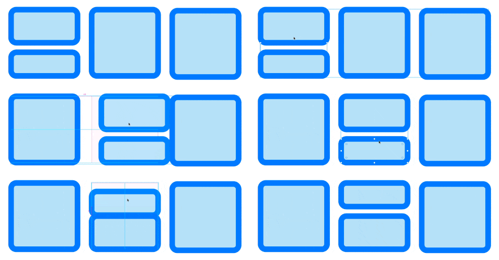
Stacks allow you to group content on an artboard and apply consistent spacing and stacking order. As you add and remove or move items in the stack everything around it shifts but maintains some sense of order.

I didn’t use them a whole lot in this project but I like the idea here and it offers functions that require plugins in Sketch. It also seems less buggy as the solutions I’ve found in Sketch.
Adobe XD vs Sketch: Conclusion
When writing this I asked myself if I would transition to XD on my next project and I think the answer is no. While there are some real beneficial features and financial advantages, I feel the limitations in reusable components and libraries are large enough that I can’t yet see making this my daily driver.


