If you’ve ever exported Figma assets or artboards to PDF, you may have noticed that the resulting file sizes can be quite large. In this article, I’ll show you how to remove unnecessary bloat, recreate styles, reduce file size, and optimize your PDFs for faster loading times. The end goal being a smaller reduced file size.
First, it’s important to understand that there are several factors that can contribute to large file sizes when exporting PDFs from Figma. Those are:
- The “Effects” feature in Figma
- Raster images not properly cropped or scaled before import
- And to a much lesser extent, embedded fonts and strokes on objects
Each section will explain the causes of file size issues and things you can do to resolve them to make your files smaller.
Figma Effects
The main culprit I’ve found in file size bloat is the “Effects” feature in Figma. This allows you to easily add drop shadows, inner shadows, layer blurs, and background blurs to your designs. These effects can be great for adding polish and visual interest, but they can also significantly increase the size of your exported PDF.
Let’s look at a quick example:
Here is a fully vector cover for an eBook we’ve been working on about accessibility in design.

We wanted to add a simple dropdshadow to the foreground graphic(s) to help set it apart from the background using Figma’s dropshadow effect.

Great. Setting the Frame to export to PDF and export, we have a 1.3mb PDF. Pretty hefty. If I remove or hide the drop shadow and export to PDF I get a 360kb PDF. That’s about 72% smaller than with the dropshadow. In a 14 page eBook, we’ve got a long way to go and I’m already concerned about what the end results of this will be. Note, the same is true of background/layer blurs using Figma Effects.
Solution
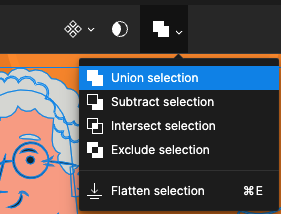
There are a few ways to handle this. The first option is to create a bit of a shadow with a semi-transparent duplication of the artwork. I duplicated the group, selected all of the individual layers/shapes and merged them with Union Selection:

From there I changed the color to black and reduced opacity to 13%:

This is not the same effect we had before but it’s an okay alternative. Another option is to convert this artwork with the shadow to a PNG with the Copy As PNG feature in Figma and paste the PNG version back into the file. At that point, the effect has been removed and the shadow is no longer editable. You can find the details of this workflow in the next Solution section.
Oversized and Uncropped Raster Images
Another factor that can contribute to large file sizes is Figma’s ability to retain the full size of an imported image even if it is cropped out of frame. This means that you may end up with a much larger raster image in your Figma file than you need, which can further increase the file size.
Let’s look at another example:
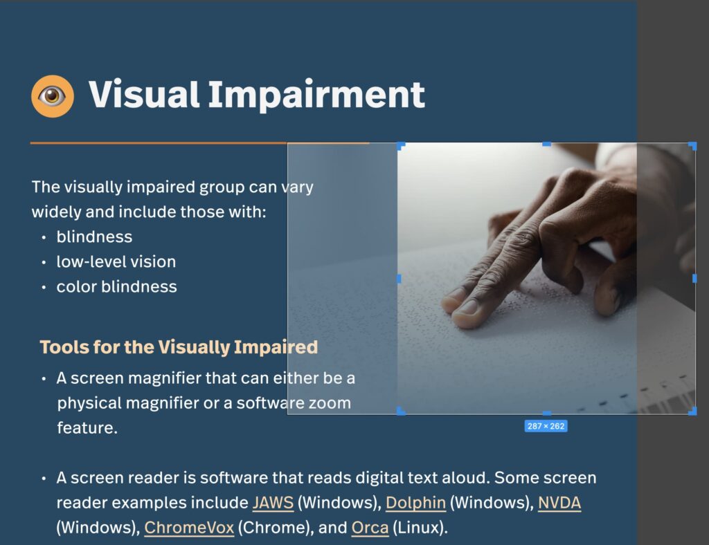
Here we have an image that we are using in a sidebar on the eBook, but granted we only want a portion of the graphic to show up. Easy enough to mask the whole image or let it overflow outside the frame/canvas to clip it when viewing or exporting.

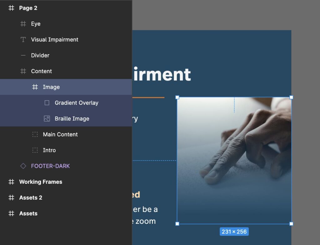
We’re going to have to modify this quite a bit to fit the design/style we have for images in sidebars in our eBook template and it’s also fairly horizontal so we’ll need to crop the image. I’ve also layered a gradient fill on top of the image to achieve the desired effect.
Exporting this frame to PDF and the resulting file is 3.2mb. That is pretty big considering this page is almost entirely text and shapes.
If we look at what is actually happening here we can see that the visible portion of the image is only a part of the image that exists in the document:

The rest of that image is still present but not showing in Figma, and also in the PDF. Additionally, I placed the raw image in Figma that I downloaded which was 1.7mb. I scaled it down in Figma but that image data is all still there in the source file and exported PDF. Now it’s a lot more clear why the PDF was so large.
Solution
The solution is relatively simple but it is best suited for when you know the design is complete and you are exporting a final PDF. The Copy as PNG feature in Figma is generally all you need. Make sure that all of the artwork that you want to be present is grouped or framed and Copy as PNG (Mac: Command + Shift + C / Windows: Control + Shift + c).

You now have a high-quality PNG image of the artwork on your clipboard. Your options now are to paste your clipboard back into the file (and resize if necessary), or take it a step further and optimize the PNG before placing it back in your Figma file.
→ Note, Figma will copy a PNG @2x of the selected art size by default. This may or may not be desired. If you want the image the exact size as the frame you are copying, set an Export option of 1x PNG on the frame before you copy.
Pasting the image from my clipboard back into the file and resizing it to fit the frame resulted in a 656kb PDF. Pasting the image into Squoosh and adding the optimized image back in resulted in a 554kb image. I’ll take it.
Outlining Fonts and Strokes
Outlining fonts and strokes used in your file and converting them to shapes does seem to have some impact on file size, although the results are pretty small.
In this example, with a stroke around all of the small boxes and using 2 different fonts, the resulting PDF is 586kb. If I outline the fonts and strokes and re-export, the result is 542kb. Again, not a drastic savings, but this is a pretty small graphic. In the case of an eBook it can add up and there may be some potential savings.
Conclusion
Figma touts itself as a “collaborative interface design tool” so I fully understand how what we’re talking about here is not a concern for everyone. But at GAP we do a lot more design than just interfaces for the aforementioned ebook, graphics for marketing content, or even collateral for OpSense, our Real-Time Enterprise Monitoring platform. Figma is a great tool and bending it for more than just interfaces is totally okay in my book. I hope that if you find yourself in the same boat that some of these tips have been helpful. Contact us for more expert help


